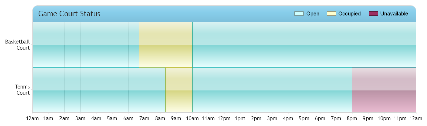
Stacked Time Scale
Demonstrates a chart with a stacked time scale.
<%@ Page Language="C#" Description="dotnetCHARTING Component" %>
<%@ Register TagPrefix="dnc" Namespace="dotnetCHARTING" Assembly="dotnetCHARTING" %>
<%@ Import Namespace="System.Drawing" %>
<script runat="server">
void Page_Load(Object sender, EventArgs e)
{
// Demonstrates a chart with a stacked time scale.
// This type of chart is achieved by using a stacked numeric x axis scale, then the numeric axis tick
// labels are replaced with a time representation.
// Setup the chart
Chart.Type = ChartType.ComboHorizontal;
Chart.Size = "850x250";
Chart.TempDirectory = "temp";
Chart.Debug = true;
Chart.ShadingEffectMode = ShadingEffectMode.Two;
// Style the titlebox.
Chart.TitleBox.Label.Text = "Game Court Status";
Chart.TitleBox.Position = TitleBoxPosition.FullWithLegend;
Chart.TitleBox.Background.Color = Color.SkyBlue;// Color.Gold;
Chart.TitleBox.CornerTopLeft = BoxCorner.Round;
Chart.TitleBox.CornerTopRight = BoxCorner.Round;
Chart.TitleBox.CornerSize = 10;
Chart.TitleBox.Padding = 8;
Chart.TitleBox.Label.Font = new Font("Trebuchet MS", 11);
Chart.DefaultElement.Transparency = 50;
Chart.YAxis.SpacingPercentage = 0;
Chart.YAxis.DefaultTick.GridLine.Color = Color.Empty;
// Setup the x axis.
Chart.XAxis.Scale = Scale.Stacked;
Chart.XAxis.Maximum = 1440;
Chart.XAxis.Interval = 60;
Chart.XAxis.AlternateGridBackground.Color = Color.Empty;
Chart.XAxis.Line.Color = Color.LightGray;
// Add axis ticks to replace the numeric ones with time formatted versions.
Chart.XAxis.ExtraTicks.Add(getTimeTicks(60, 1440));
// Add a custom legend box.
Chart.DefaultSeries.LegendEntry.Visible = false;
Chart.LegendBox.ExtraEntries.Add(new LegendEntry("Open", "", Chart.Palette[3]));
Chart.LegendBox.ExtraEntries.Add(new LegendEntry("Occupied", "", Chart.Palette[2]));
Chart.LegendBox.ExtraEntries.Add(new LegendEntry("Unavailable", "", Chart.Palette[1]));
// Create some elements.
Element e1 = new Element("Tennis Court", 500);
Element e2 = new Element("Basketball Court", 400);
Series s1 = new Series();
s1.AddElements(e1, e2);
Element e3 = new Element("Tennis Court", 100);
Element e4 = new Element("Basketball Court", 200);
Series s2 = new Series();
s2.AddElements(e3, e4);
Element e5 = new Element("Tennis Court", 600);
Element e6 = new Element("Basketball Court", 1200);
Series s3 = new Series();
s3.AddElements(e5, e6);
Element e7 = new Element("Tennis Court", 600);
Series s4 = new Series();
s4.AddElements(e7);
s1.DefaultElement.Color = Chart.Palette[3];
s2.DefaultElement.Color = Chart.Palette[2];
s3.DefaultElement.Color = Chart.Palette[3];
s4.DefaultElement.Color = Chart.Palette[1];
// Add the random data.
Chart.SeriesCollection.Add(s1, s2, s3, s4);
}
// Method helps create a fake timeline on a numeric scale representing minutes.
AxisTickCollection getTimeTicks(int interval, int max)
{
AxisTickCollection atc = new AxisTickCollection();
string label = "";
for (int i = 0; i * interval <= max; i++)
{
TimeSpan ts = TimeSpan.FromMinutes(i * interval);
if (ts.Hours == 0)
label = "12am";
else if (ts.Hours == 12)
label = "12pm";
else if (ts.Hours < 12)
label = ts.Hours + "am";
else
label = (ts.Hours - 12) + "pm";
AxisTick at = new AxisTick(i * interval, label);
atc.Add(at);
}
return atc;
}
</script>
<html xmlns="http://www.w3.org/1999/xhtml">
<head>
<title>.netCHARTING Sample</title>
</head>
<body>
<div align="center">
<dnc:Chart ID="Chart" runat="server" />
</div>
</body>
</html>
<%@ Page Language="vb" Description="dotnetCHARTING Component" %>
<%@ Register TagPrefix="dnc" Namespace="dotnetCHARTING" Assembly="dotnetCHARTING" %>
<%@ Import Namespace="System.Drawing" %>
<script runat="server">
Sub Page_Load(ByVal sender As Object, ByVal e As EventArgs)
' Demonstrates a chart with a stacked time scale.
' This type of chart is achieved by using a stacked numeric x axis scale, then the numeric axis tick
' labels are replaced with a time representation.
' Setup the chart
Chart.Type = ChartType.ComboHorizontal
Chart.Size = "850x250"
Chart.TempDirectory = "temp"
Chart.Debug = True
Chart.ShadingEffectMode = ShadingEffectMode.Two
' Style the titlebox.
Chart.TitleBox.Label.Text = "Game Court Status"
Chart.TitleBox.Position = TitleBoxPosition.FullWithLegend
Chart.TitleBox.Background.Color = Color.SkyBlue ' Color.Gold;
Chart.TitleBox.CornerTopLeft = BoxCorner.Round
Chart.TitleBox.CornerTopRight = BoxCorner.Round
Chart.TitleBox.CornerSize = 10
Chart.TitleBox.Padding = 8
Chart.TitleBox.Label.Font = New Font("Trebuchet MS", 11)
Chart.DefaultElement.Transparency = 50
Chart.YAxis.SpacingPercentage = 0
Chart.YAxis.DefaultTick.GridLine.Color = Color.Empty
' Setup the x axis.
Chart.XAxis.Scale = Scale.Stacked
Chart.XAxis.Maximum = 1440
Chart.XAxis.Interval = 60
Chart.XAxis.AlternateGridBackground.Color = Color.Empty
Chart.XAxis.Line.Color = Color.LightGray
' Add axis ticks to replace the numeric ones with time formatted versions.
Chart.XAxis.ExtraTicks.Add(getTimeTicks(60, 1440))
' Add a custom legend box.
Chart.DefaultSeries.LegendEntry.Visible = False
Chart.LegendBox.ExtraEntries.Add(New LegendEntry("Open", "", Chart.Palette(3)))
Chart.LegendBox.ExtraEntries.Add(New LegendEntry("Occupied", "", Chart.Palette(2)))
Chart.LegendBox.ExtraEntries.Add(New LegendEntry("Unavailable", "", Chart.Palette(1)))
' Create some elements.
Dim e1 As Element = New Element("Tennis Court", 500)
Dim e2 As Element = New Element("Basketball Court", 400)
Dim s1 As Series = New Series()
s1.AddElements(e1, e2)
Dim e3 As Element = New Element("Tennis Court", 100)
Dim e4 As Element = New Element("Basketball Court", 200)
Dim s2 As Series = New Series()
s2.AddElements(e3, e4)
Dim e5 As Element = New Element("Tennis Court", 600)
Dim e6 As Element = New Element("Basketball Court", 1200)
Dim s3 As Series = New Series()
s3.AddElements(e5, e6)
Dim e7 As Element = New Element("Tennis Court", 600)
Dim s4 As Series = New Series()
s4.AddElements(e7)
s1.DefaultElement.Color = Chart.Palette(3)
s2.DefaultElement.Color = Chart.Palette(2)
s3.DefaultElement.Color = Chart.Palette(3)
s4.DefaultElement.Color = Chart.Palette(1)
' Add the random data.
Chart.SeriesCollection.Add(s1, s2, s3, s4)
End Sub
' Method helps create a fake timeline on a numeric scale representing minutes.
Function getTimeTicks(ByVal interval As Integer, ByVal max As Integer) As AxisTickCollection
Dim atc As AxisTickCollection = New AxisTickCollection()
Dim label As String = ""
Dim i As Integer = 0
Do While i * interval <= max
Dim ts As TimeSpan = TimeSpan.FromMinutes(i * interval)
If ts.Hours = 0 Then
label = "12am"
ElseIf ts.Hours = 12 Then
label = "12pm"
ElseIf ts.Hours < 12 Then
label = ts.Hours & "am"
Else
label = (ts.Hours - 12) & "pm"
End If
Dim at As AxisTick = New AxisTick(i * interval, label)
atc.Add(at)
i += 1
Loop
Return atc
End Function
</script>
<html xmlns="http://www.w3.org/1999/xhtml">
<head>
<title>.netCHARTING Sample</title>
</head>
<body>
<div align="center">
<dnc:Chart ID="Chart" runat="server" />
</div>
</body>
</html>